Colour theory
Colour theory contains many different principals, ideas and rules used by artists to harmonise and match colours. Colour theory is based heavily on the colour wheel, which features the primary colours red, blue and yellow, secondary colours orange, violet and green, and the in between colours of the first 6.
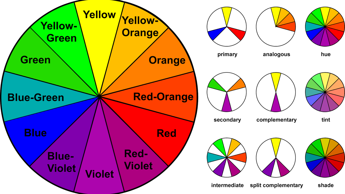
With colour theory there are several different combinations commonly used. One of these is analogous, which refers to using the colours that are adjacent to a colour in the colour wheel, for example, If you were to use blue, blue-violet and blue-green would be analogous colours to use.
Complementary colour schemes refer to using colours opposite on the colour wheel. this would mean something like yellow and purple, or orange and blue.
Split complementary refers to splitting the colour wheel into three parts, or using the colours adjacent to the opposite colour on the colour wheel
Different colours also have symbolism and certain meanings. these can be used to make the viewer associate certain emotions and feelings with a character, environment or scene.
Red is often used to symbolise emotional intensity as it is often associated with blood, war, danger and love. It also has a connotation of representing high energy, and is often used as an eye catching colour
Orange Is associated with the sun/warmth, positivity, creation and determination. The colour has many similar qualities shared with both red and yellow, but comes across as less aggressive as read and warmer and more welcoming than yellow.
Yellow is often used to symbolise warmth, sunshine, happiness and energy, but in darker and duller colours it can give a feeling of sickness, jealousy and caution. depending on the hue, tint and shade of the colours, yellow can be used to represent joy or danger.
Green is used commonly in art to symbolise nature. It has a strong emotional link with safety and is often used to portray growth, harmony and hope. Dark green however can also be used to symbolise money, greed and ambitions.
Blue Is also heavily connotative of nature, but relates more to the ocean and the open sky. It is emotionally linked to many emotions such as tranquility, sincerity and calmness. Blue is often marketed as a more masculine colour, and is also known to suppress apetite, so shouldnt be used heavily in art or photography involving food
Purple is often associated with royalty, and gives the impression of wealth, mystery and wisdom. Purple is also very rare in nature, which is what reflects its regal and wealthy connotation. Purple is considered to be a fairly feminine colour. Purple is also said to invoke nostalgia, but in darker shades evoke feelings of sadness and frustration.
Comments
Post a Comment